Hospitality · Premium stays
Teder
Turning the meaning of a name into a mark.
Teder is a premium hospitality brand. Its name is the Hebrew word for “frequency,” a nod to the founders’ belief that guests will return again and again over a lifetime. My job was to make that idea visible.
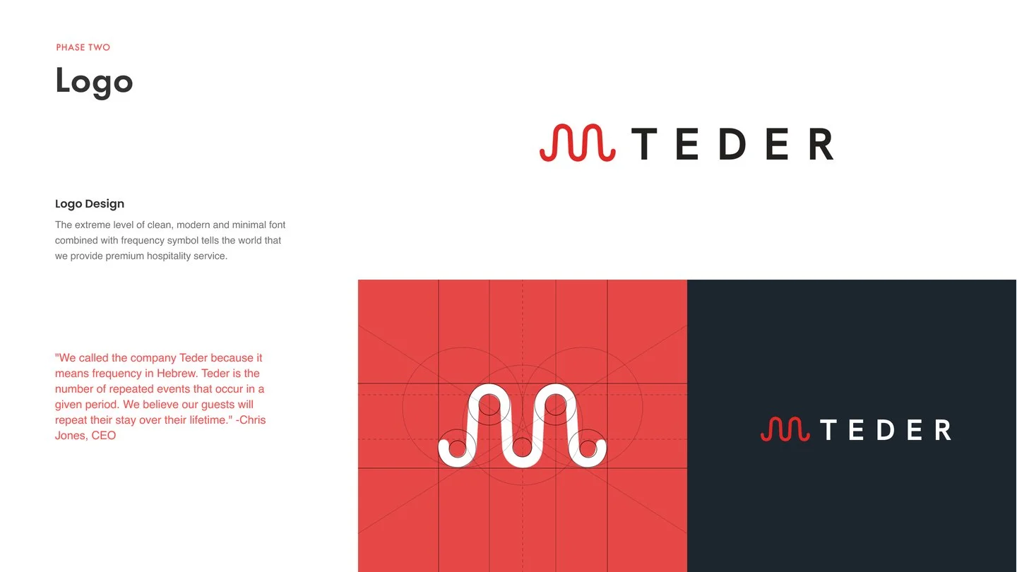
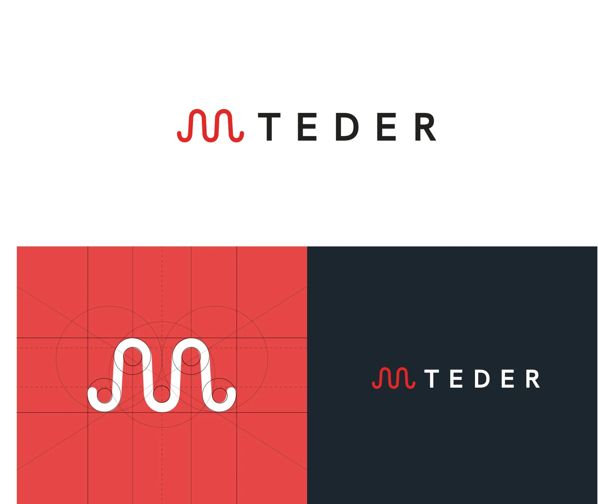
I designed a clean, modern wordmark paired with a frequency symbol: one continuous wave that captures rhythm and return. Quiet, confident, and unmistakably premium, it scales from an app icon to signage without losing its character.
“Clean, modern and minimal.”
Logo design
A symbol built on repetition
“We called the company Teder because it means frequency in Hebrew. Teder is the number of repeated events that occur in a given period. We believe our guests will repeat their stay over their lifetime.”
Chris Jones, CEO
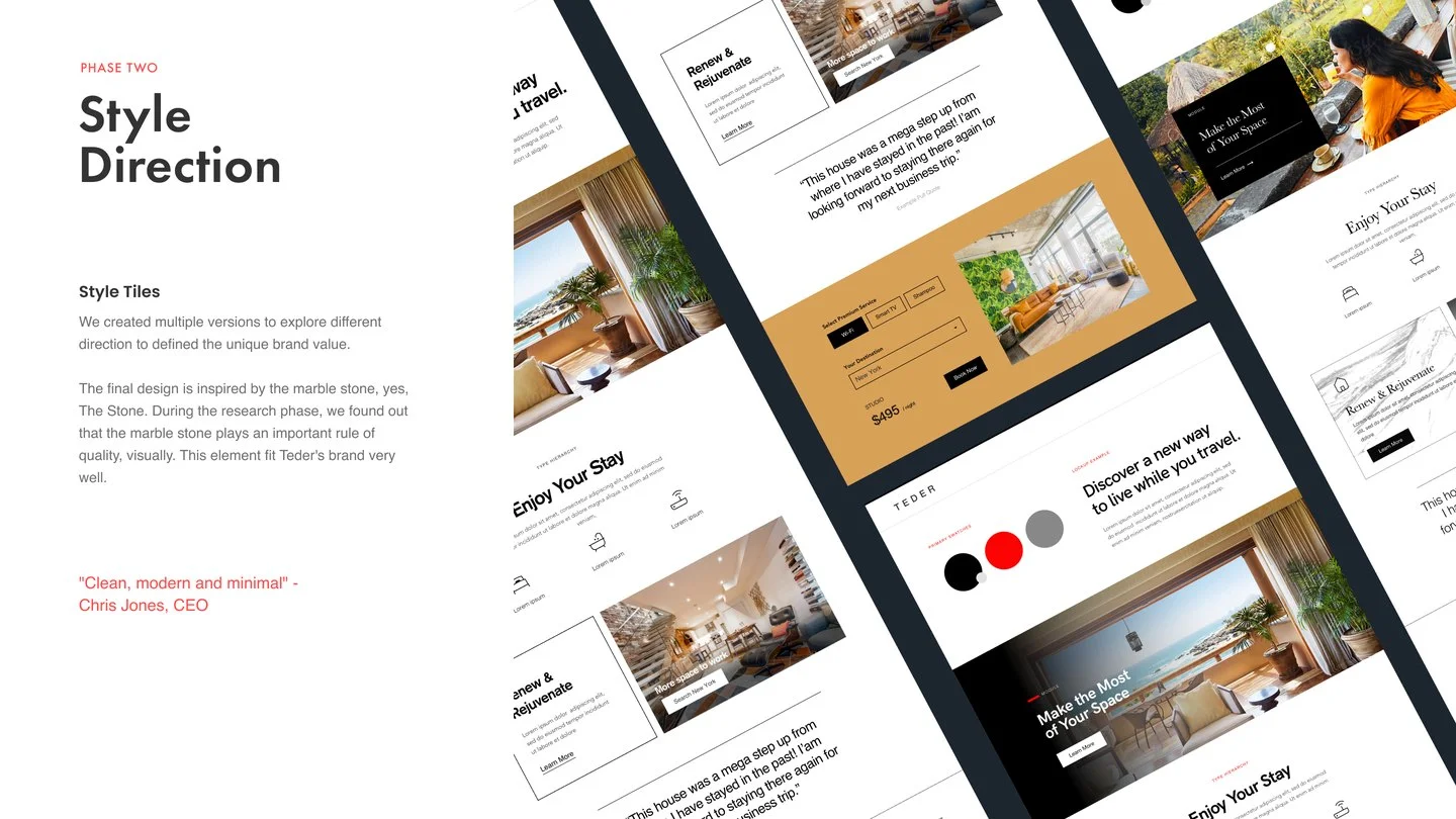
Style direction
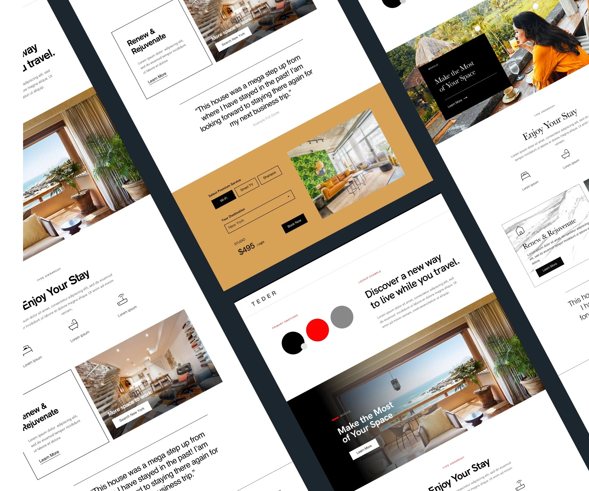
Inspired by marble
I explored several style tiles to define the brand’s visual voice. The final direction draws on marble, a material that reads as quality and permanence at a glance, paired with a restrained palette of signal red, charcoal, and warm natural photography.
Brand in the product
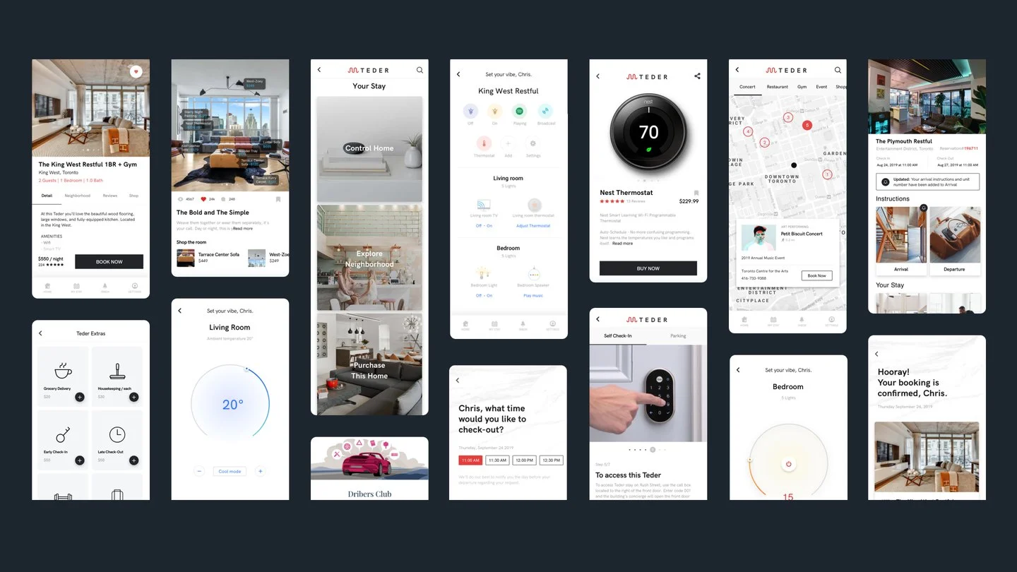
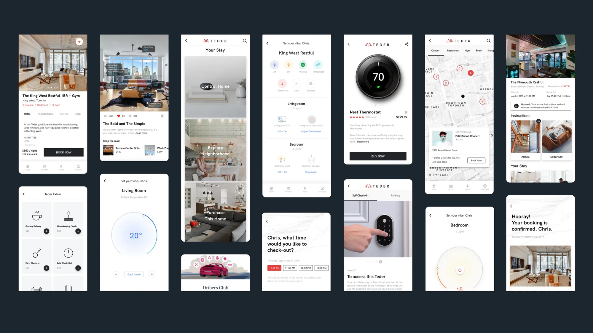
A calm, premium guest app
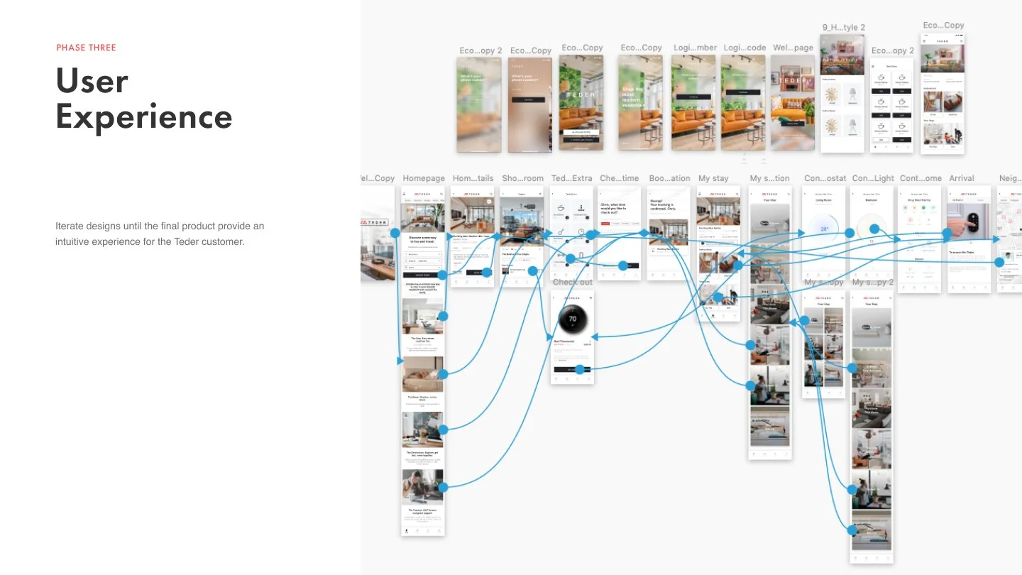
The identity extends into the guest app: booking, digital check-in, smart-lock room access, and in-room climate control, all in the same calm, minimal language. The brand promise of an effortless stay becomes the experience itself.
Original design files
Teder
Brand and product deck: logo design, style direction, UX flows, and the guest app.